Creating new content or editing existing messaging can be harder than it seems! This guide can help make sure everyone involved in creating, editing, and approving your content—whether a team of 1 or a department of 1,000—is on the same page when it comes to how your online content is written and organized.
This document is an ongoing collaboration between University Relations, Office for Diversity, Equity, and Inclusion, Disability Accommodations and Resources, Disability Resource Center, and Information Technology Services.
Content writing and editing goals
Before you even start to write, consider the goals of your content—how does it serve your strategic objectives and what’s most important considering your audience and modes of delivery and/or interaction?
With each piece of content aim to:
- Translate: Make complex information clearer and more understandable.
- Educate: Describe context and options clearly so that users can make informed decisions.
- Create inclusion and access: Excluding users through confusing or biased language, or inaccessible material, can work against users trying to engage with your content.
- Respect: Users who feel that their time was respected and valued are more likely to connect, engage, and return to your content.
Content should be:
- Actionable: Be clear about what you want your user to do, and give enough information so they can make informed decisions.
- Useful: Craft your content so it fulfills the needs of your user.
- Usable: Plan your content so it is easy to use and understand.
- Concise: Can you clearly frame your content in as few words as possible?
- Engaging: It’s OK to bend a few rules to make your copy relatable, warm, and human.
- Informative: Let users make their own choices. Don’t try to “sell” a product or service, but rather demonstrate an understanding of their needs and inform them of appropriate choices.
Voice and tone
You have the same voice all the time, but your tone can change in different situations. You might use one tone when you’re out to dinner with your closest friends, and a different tone when you’re in a meeting with your boss. It can be the same when you’re writing for UC Santa Cruz, depending on your audience and your goals.
Familiarize yourself with UCSC “tone” and voice.
Access and inclusion
When writing, you want to build trust with your audience and not leave anyone out. Your aim is to help them understand what you’re saying so they can take action from your words if they choose. Writing with accessibility and inclusion in mind helps to achieve those goals. Some ways to increase inclusivity in your writing include following guidelines for writing for the web, using plain language, writing for inclusion, and including clear calls to action.
Writing for the web
Writing for the web is different from other forms of writing because users generally scan online content looking for what they need instead of thoroughly reading it. Anticipating this, here are a few ways to make your content easily digestible for quick reading and scanning.
Use plain language
Plain language is communicating in an unfussy way so your users can understand you the first time they read or hear it. The benefits of plain language are both tangible and intangible:
- Plain language gets your message across in the shortest time possible.
- More people are able to understand your message.
- There is less chance that your content will be misunderstood, so you spend less time explaining it to people. If your content gives instructions, your readers are more likely to understand them and follow them correctly.
Research shows that plain language affects your bottom line and can save time, resources, and money. When you use words people understand, content is more findable, accessible, and inclusive. When you use jargon in writing, you risk losing user trust. Government, legal, business, and academic jargon are often vague or unfamiliar to users, and can lead to misinterpretation, confusion, or resentment.
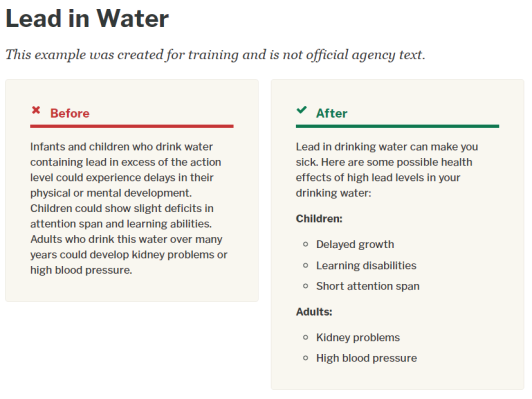
Use of plain language improves reading comprehension. It helps reduce the chances information will be wrongly interpreted, and helps users understand consequences.
Be user focused
Frame content in a fashion that anticipates and meets user needs. Think about why the user needs your content.
- Put yourself in their shoes: As a [user], I want to [do something], so I can [meet a need].
- Once you have that information, use it to guide your copywriting.
Use inclusive and bias-free language
Strive to use language that is free of bias and avoid perpetuating prejudicial beliefs or demeaning attitudes. Just as you check writing for spelling, grammar, and wordiness, practice reading your work for bias. Writing for inclusion addresses the individual characteristics of age, disability, gender, participation in research, racial and ethnic identity, sexual orientation, socioeconomic status, and intersectionality.
Use actionable language
Users are most often looking to complete a task, and your content should be structured in a way that helps them understand and take action. That means you need to be clear and predictable with your direction. There is no one single approach that works in all cases, but in general, actions tend to start with verbs, may include time-sensitive language, and are usually brief.
Calls to action
These are your statements designed to get an immediate response. Lead with an action word that is contextually connected to the action to be taken. Give step-by-step directions or provide a link that does.
For example:
- RSVP today
- Donate now
- If you’d like to help make sure this class or others like it continue, please contact Sarah Schuster Kudela, director of development for the Arts Division.
Don’t assume the user knows how to perform a task. Don’t use unusual words, acronyms, or idioms when possible. Don’t assume the user knows how to perform a task. Don’t use unusual words, acronyms, or idioms when possible.
Avoid directional language
Directional language such as “above/below” or “right/left” can be confusing and unhelpful when spoken aloud by screen readers. The same goes for links that say “click here.” These practices also make it hard to translate copy for international audiences and can conflict with mobile design patterns. Keep instructions and their related actions close together, so directional language isn’t needed.
For example:
- Don’t do this: Click the link to the right of the icon to go to the Giving site and donate.
- Do this: Go to our Giving site to donate.
- Don’t do this: To donate, click here.
- Do this: Go to our Giving site to donate.
Be concise and specific
- Most users scan content. They may never read the most important information if it’s buried at the bottom of a page or document. Lead with the most important content in sentences, paragraphs, sections, and pages.
- Use short words, simple words, phrases and sentences. Avoid unnecessary modifiers or idioms.
- Avoid vague or embellished language. The more words you ask users to read, the more opportunity for misunderstanding, or for them becoming overwhelmed and leaving the page.
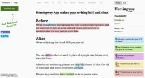
TL;DR (too long, didn’t read)
- If you put too much copy on your page, chances are, it won’t all get read. Try not to do this.
Structuring your content
Large bodies of text and chunking content
Chunking is a strategy to lay out your web content in small, digestible pieces, which has been shown to improve comprehension. It calls for shorter paragraphs, or breaking up your paragraphs with bullet points. It also calls for grouping related ideas together and using descriptive headings and subheadings.
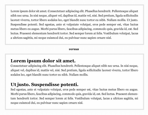
Breaking your copy into short paragraphs will help readers through it.
What should your heading be like? In most cases, it’s best to use headings to clarify what you are talking about in the paragraph below them. Users want to skim and scan for information, and headings help this process.
Headings
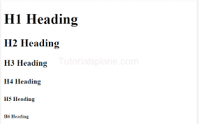
With web copy, using heading levels (instead of larger fonts or bold) is how you accessibly rank your content by importance. The H1 level has the highest rank and should only be your page title, and the H6 level has the lowest rank. In Google docs, you can find headings in the ribbon directly above the document in the Styles pulldown menu, to the left of the Font pulldown.
Because H1 is often your page title, nest headings accordingly, without skipping a level. So, if your main headline is in H1, make your subheadings in your copy H2, and so on. Always follow the “ladder” of heading levels—up or down. Two headings with the same level have equal rank.
Heading should be:
-
Informative and descriptive:
- Highlight the most important concept or piece of information
- Help users understand what they’ll find in the section below
-
Concise and scannable:
- Use simple, clear language
- Keep headings to just a few words, or at most a single sentence
- Avoid using punctuation such as periods, commas, or semicolons
Links and calls to action
Provide links in context
Make sure all links are provided in context, at the point in the content at which they’re useful. Don’t put all the links together at the bottom of the page.
Don’t use unsorted lists of related links to point users to content you think they might be interested in. These are sometimes known as “further reading” or “more information.” A better approach is to consider building that content into the page you are on.
Writing link text
When writing a link, make it descriptive and front-load it with relevant terms instead of using something generic like “Click here” or “More.” Generic links do not make sense out of context or tell users where a link will take them.
For links that lead to information rather than action, use the text about that information as the link. Example: Always check your copy using accessibility testing.
Consider using the title of the page the link goes to as your link text. Example: For more information about UC Santa Cruz’s living-and-learning communities, see UCSC’s 10 Colleges.
If your link takes the user to a page where they can start a task, start your link with a verb. Example: Apply for housing
Do not use the same link text to link to different places.
Links help people scan content, so do not swamp them with too many or link to the same tool or webpage throughout your page. Think about the size of the link users need to select. For users with reduced motor skills, a one-word link could be very difficult to select. Aim to include two to five words in your link text.
Links and your calls to action should be predictable, and should open in the current window.
-
Do not place full URLs into your copy
- Do this: Read this news article.
- Don’t do this: Read this news article: https://news.ucsc.edu/2022/09/ramses-the-great-talk-sullivan-danwhite.html
-
Don’t include preceding articles (a, an, the, our) when you link text.
- Do this: Read the library guide for details
- Don’t do this: Read the library guide for details.
Don’t use generic links like “read more” and “click here.” Associate the action in context to what the user will be doing. They also do not work for people using screen readers, who often scan through lists of links to navigate a page. It’s important the links are descriptive so they make sense in isolation.
- Do this: View the syllabus.
-
Don’t do this: Click here to view the syllabus.
- Do this: Canvas video tutorials
- Don’t do this: Learn more about Canvas video tutorials.
- Do this: Required reading: 18th Century Architecture
- Don’t do this: Read this required article about 18th Century Architecture: https//www.reallylongurl.com/architechture-cen-18-default/145aspx
- Do this: Download the assignment.
- Don’t do this: Use this link to download the assignment.
Do not underline text
- Underline text = link. Using underline for emphasis is misleading and should be avoided.
Buttons
Buttons should be clear and predictable, and should always contain actions. Use descriptive text that uses a call to action and wording unique to the page. The button should help the user understand the action they are about to take.
- Do this: Log in, Sign up, Email us, Join our group
-
Don’t do this: Learn more, Click here
Microcopy
A type of call to action, microcopy is small bits of copy that help your users take action. Your microcopy should be:
- Extremely concise and compact
- In plain language, not technical jargon, even conversational
- Actionable with buttons only including the action the user will take by clicking
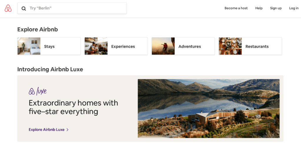
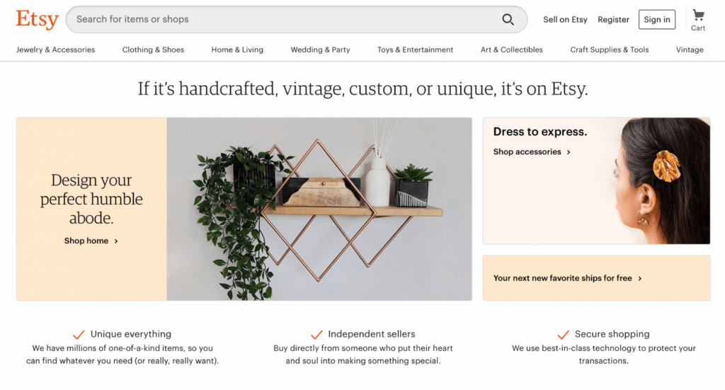
Microcopy should also reduce worries
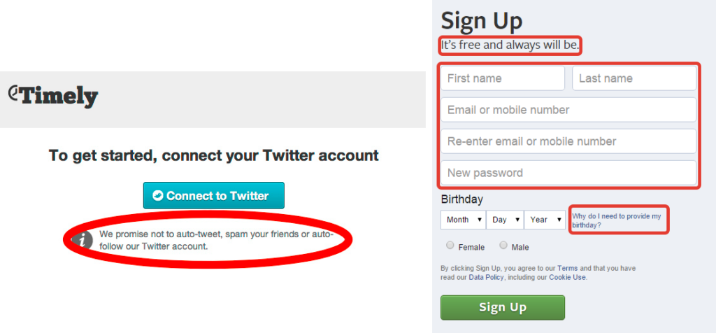
- If there could be consequences (for example, getting spam after providing an email address), reassure your users with copy that allays their fears.
-
Examples:
-
Button: Take the survey
(It’s short!) -
Button: Sign up
(We will never share your email address)
-
Button: Take the survey
- If an action is required, explain why, before the action needs to be taken so that users with screen readers are aware before it happens.
Confirmation messages
- Be concise
- Make sure you are using it for a singular action
- Be clear if the action is not reversible or easy to undo
Error messages
- Should tell you what is wrong, and how to fix it
Tables
Tables can easily become problematic for accessibility and in general are not recommended for use, with some exceptions. There are two basic uses for tables on the web: data tables and layout tables. The original intended use of HTML tables was for tabular data, where data is organized with logical relationships in grids.
If you do use tables, make sure they have the structural markup to make them accessible. It is best to simplify tables as much as possible to minimize the cognitive load they require to understand.
Try not to use layout tables for visual presentation. Layout tables do not have logical headers that can be mapped to information within the table cells. Instead use CSS for visual presentation.
Images and alt tags
Crafting useful alternative (alt) text for images is both art and science. Use the guidance on How to write effectivealt text. In summary, though:
- Be brief, one sentence.
- Describe the image in relation to the story.
- Don’t be redundant/provide the same information as text within the context of the image.
- Don’t use the phrases “Image of …” or “Graphic of …” to describe the image. It’s redundant.
Fonts and text colors
The UC Santa Cruz Communications & Marketing site has designated official UCSC web fonts and color palettes. Always use text and background color combinations that pass contrast ratios at 4.5:1.
Video
To ensure accessibility and usability, all video content should be captioned. Consider tools like Kaltura, YouTube, or Vimeo, then embedding your video. Hosting videos in your media library can affect page-load speed.
Use the guidance on how to Create accessible video and audio content. If you use auto-captions, they should always be reviewed for accuracy.
- Make sure you have copyright permissions, and source images properly when needed.
404 pages
Regardless of what we do, 404 pages will always be a factor, especially for mobile users mistyping a URL.
- Keep the messaging positive. Voice and tone are important on these pages.
- Make them look the same as the rest of the site.
- The user found the page in error. Help them continue looking with a search bar, links to pages they might be seeking, or at minimum a link to the homepage to start their search over.
Forms
Form titles should clearly and quickly explain the purpose of the form, while being thoughtful and respectful.
Technical form design
- Keep forms as short as possible.
- Use a single column format, with a left justification if possible. Insert image below
- Only request information that is needed and that you intend to use.
- Do not use placeholder information in your form fields.
-
If there is contextual or assistive information needed, provide that microcopy before the form field response.
- An example of this is restrictions on a password.
-
Be sure the action for submitting information always comes last, after input fields.
- Make sure to highlight active fields.
- Include date pickers or other auto-complete methods to prevent errors.
-
For large forms:
- Make sure to group like items
- Consider a step-by-step indicator
- Allow users to save and return
Inclusionary form design
- Design forms for gender diversity and inclusion.
- First, decide if an input field on gender, sex, race, or ethnicity is necessary at all, and if so, be mindful of purpose and language you use.
- If you do need to ask, provide a text input field in addition to any options so the user can provide their identified information, or the option not to answer.
-
If you need to ask about gender or sex on forms:
- Because we are all unique, defined choices might not include all the possible ways a person might identify. If a user doesn’t identify with your options, it may be a hurtful reminder of how their journey is not reflected in the world.
- Consider a text answer, allowing the user to input the way they self-identify.
-
If you do list choices for the user to input:
- Go beyond binary gender answers (for example, male or female) because they are not inclusive of trans and gender nonconforming people.
- Consider asking for pronouns if that is all that is required.
- Try not to use labels like “other,” “custom” or “neutral.” Instead try labels like, “If not listed, please write your gender.”
- Include a choice of “Prefer not to say.”
-
If you need to ask about race or ethnicity on forms:
- Be sure you are categorizing race or ethnicity correctly.
- Do not assume that one choice is the default.
- Allow for checkboxes to select all that apply.
- Include a choice of “Prefer not to say.”
Optimizing for search and page speed
A key tactic for optimizing your content for search, also known as search engine optimization (SEO), is to align your content with the language that people use when searching for similar topics and content. To optimize your content, use analytics to research your site’s search keywords, try card sorting, or other user research methods. Tools like Google Trends can be helpful too.
Include short, but keyword-rich summary content to introduce the user as to what they can expect on your page. Consider a content strategy and information architecture on your site to create logical structure, and clear navigation paths. Test the site with users to see how it works. Iterate.
Do not use tactics like long lists of keywords in your metadata, sometimes called keyword stuffing.
Specific types of content
PDF, Power Point, Excel, or Word documents
In most cases, it is better to create HTML content that can be optimized for use, but there are circumstances where you might need to add a .pdf, .xls(x), .ppt, or .doc file to your web content. Follow the guidance Creating Accessible Documents to understand how to structure your content, as well as the guidance on writing for the web to create better content.
Technical writing
With more technical content, the user is often looking for something specific and would generally prefer to find content that is as self-service as possible. Guides, how-to’s, tutorials, and help documentation are common forms technical content can take.
All of the principles of writing for the web apply to technical content, with some specific highlights:
- Keep it focused. Limit the scope to one or two ideas only.
- Screenshots, videos, and GIFs may be helpful to orient new users, but might not be necessary for every document. Be sure to focus attention with visuals, and be sure they meet accessibility standards.
- Ordered lists are for step-by-step instructions.
- Unordered lists display examples or multiple notes.
Legal language
Sometimes legal content such as terms of use, trademark, and policy content are necessary, and you may not be able to alter the copy.
The principles of writing for the web can provide general guidance, but also consider these tactics:
- Be factual.
- Define insider or jargon-like terms.
- Do not offer legal advice.
-
Use plain language where possible.
- Do this: “If you sign up on behalf of a company or other entity, you represent and warrant that you have the authority to accept these Terms on their behalf.”
- Don’t do this: “If an individual purports, and has the legal authority, to sign these Terms of Use electronically on behalf of an employer or client then that individual represents and warrants that they have full authority to bind the entity herein to the terms of this hereof agreement.”
Writing for inclusion
It’s important to write for, and about people in a way that’s inclusive, empathetic, compassionate, and respectful. In general, be mindful to describe only relevant characteristics, and consider whether including the information is necessary to the copy. Be aware that terminology in this area is constantly evolving.
Be sensitive to labels
Respect the language people use to describe themselves; that is, call people what they call themselves. If a description is needed, source the associated advocacy group for the appropriate description. Accept that language changes with time and that individuals within groups sometimes disagree about the designations they use.
Acknowledge people’s humanity
Choose labels with sensitivity, ensuring that the individuality and humanity of people are respected. Avoid using adjectives as nouns to label people (e.g., “the gays,” “the poor”) or labels that equate people with their condition (e.g., “amnesiacs,” “schizophrenics,” “autistics,” “the learning disabled,” “drug users”).
For example:
Instead of: The gays
Try this: The LGBTQ community
Instead of: Schizophrenics
Try this: People with schizophrenia
Instead of: Drug users
Try this: People with substance use disorders
For more on this topic, see “The disability community” section below.
Avoid euphemisms like “special” such as in “special needs” as it stigmatizes that which is different.
Avoid false hierarchies
Compare groups with care. Bias occurs when authors use one group (often their own group) as the standard against which others are judged (e.g., using citizens of the United States as the standard without specifying why that group was chosen). For example, usage of “normal,” “the general public,” or “most people” may prompt readers to make the comparison with “abnormal,” thus stigmatizing individuals with differences.
Avoid terms like “special rights” to characterize equal rights or equal protections.
The disability community
The language to use where disability is concerned is evolving. The overall principle for using disability language is to maintain the integrity (worth and dignity) of all individuals as human beings, using person-first or identity-first perspectives.
The disability community is sometimes used as a label representing all persons with disabilities, but it should be noted that cultures within the disability community self-identify differently. Some people who might have what is considered to be one of the five categories of disability (visual, hearing, speech, cognitive, motor) might not identify as having a disability at all.
Try not to refer to a person’s disability unless it’s relevant to what you’re writing.
If you need to mention it, emphasize the person first:
- ”Jim has a disability” rather than “Jim is disabled.”
- A person in a wheelchair, rather than problematic terms like “wheelchair-bound person.”
- A person with a physical disability, rather than problematic terms like “cripple.”
- A person with mental illness, rather than problematic terms like “nuts, dumb, or crazy.”
Avoid euphemisms such as “differently abled,” “special needs,” “physically challenged,” or “handi-capable.” They are considered condescending.
Avoid sensationalizing a disability by saying “afflicted with,” “suffers from,” “victim of.”
It is more accurate to cite the specific disability or disabilities in question. The term “functional needs” is preferred when a term is required for function, job, or circumstance, not a person. For example, “addressing the functional needs of people with disabilities” could be used when referring to a facility or program.
Age
Try not to refer to people using age-related descriptors like “young,” “old,” ‘seniors,” “elderly,” or in specifics of associated terms like Social Security, Medicare, or conditions like dementia. Don’t reference a person’s age unless it’s relevant to what you’re writing. If it is relevant, include the person’s specific age, offset by commas.
Note that you only hyphenate ages when the age is an adjective that comes before the noun and modifies the noun, or acts like a noun (see below).
- My 17-year-old niece wrote a poem about packaging for National Bubble Wrap Appreciation Day.
Do not hyphenate ages when the age is part of an adjective phrase after the noun.
- Sri is 37 years old. (Not: Sri is 37-years-old.)
- Benny’s twin sons are nearly 2 years old. (Not: Benny’s twin sons are nearly 2-years-old.)
For ages, always use figures, for brevity and readability.
- Do this: She is 16.
- Don’t do this: She is sixteen.
Correct examples of hyphenation:
- The student is 21 years old.
- A 21-year-old student.
-
The contest is for 18-year-olds. (
Also hyphenate ages when the age is acting like a noun, as in this case. ) - He is in his 20s.
Explore more on language connected to age, (apa.org).
Hearing
Use “deaf” or “hard of hearing” as an adjective to describe a person with significant hearing loss. When referring to a community of people who self-identify as Deaf, capitalize the word “Deaf.” You can alternatively use the term “Deaf Community.”
- You can also use person-first language such as a ”person who is hard of hearing.”
Personal medical information
Because of privacy laws, we should not be sharing or mentioning any HIPAA (Health Insurance Portability and Accountability Act)–related information such as personally identifiable medical information.
If personal medical information is required, use the same people-first rules.
Referencing groups: Seek out the specific advocacy group and trust the terms of those advocacy groups on how to refer to groups of people.
Referencing Individuals: Get permission for any designation.
Cognitive and learning disabilities
Because of privacy laws, we should not be publishing, sharing or mentioning any HIPAA (Health Insurance Portability and Accountability Act)–related information such as personally identifiable medical information.
If personal medical information is required, use the same people-first rules. Don’t refer to a person’s cognitive or learning disability unless it’s relevant to what you’re writing. Never assume that someone has a medical, cognitive, or learning disability. Don’t describe a person as “mentally ill.”
People who are blind or have low vision
- Use the adjective “blind” to describe a person who is unable to see.
- Use “low or limited vision” to describe a person with limited vision.
Explore more on
language connected to disability, (apa.org).
Gender
Gender refers to the attitudes, feelings, and behaviors that a given culture associates with a person’s biological sex. Gender is a social construct and a social identity. Examples include man/male; woman/female; or a nonbinary gender (e.g., genderqueer, gender-nonconforming, gender-neutral, agender, gender-fluid).
Sex, or assigned sex, refers to a biological sex assignment such as male, female, or intersex. The terms related to gender and sex are often conflated, making precision essential to writing about gender and/or sex without bias.
Make content gender neutral whenever possible.
When writing about a person, use their identified name, or identified pronouns. Do not use the term “preferred” pronouns, because this implies choice about one’s gender. When referring to individuals whose identified pronouns are not known or when the gender of a generic or hypothetical person is irrelevant within the context, use the singular “they” to avoid making assumptions about an individual’s gender.
Avoid terms that imply binaries. Avoid referring to one sex or gender as the “opposite sex” or “opposite gender”; appropriate wording may be “another sex” or “another gender.” Don’t call groups of people “guys.” Don’t call women “girls.”
Use gender-neutral terms in descriptions instead of gender-specific ones.
- “Server” instead of “waitress”
- “Business person” instead of “businessman”
Explore more on language connected to gender, (apa.org).
Sexual orientation
Sexual orientation is a part of individual identity that includes “a person’s sexual and emotional attraction to another person and the behavior and/or social affiliation that may result from this attraction.”
Some examples of sexual orientation are lesbian, gay, heterosexual, straight, asexual, bisexual, queer, polysexual, and pansexual (also called multisexual and omnisexual). For example, a person who identifies as lesbian might describe herself as a woman (gender identity) who is attracted to women (sexual orientation).
However, someone who identifies as pansexual might describe their attraction to people as being inclusive of gender identity but not determined or delineated by gender identity. Note that these definitions are evolving and that self-identification is best when possible.
Try not to refer to a person’s sexual orientation unless it’s relevant to what you’re writing.
Use the following words as modifiers, but never as nouns:
- lesbian, gay
- bisexual
- transgender, trans
- LGBTQIA+
Don’t use these words in reference to LGBTQIA+ people or communities:
- homosexual, homosexuality
- queer
- lifestyle
- sexual preference
- preference
Explore more on language connected to sexual orientation, (apa.org).
Racial and ethnic identity
Race refers to physical differences that groups and cultures consider socially significant. For example, people might identify their race as Aboriginal, African American or Black, Asian, European American or white, Native American, Native Hawaiian or Pacific Islander, Māori, or some other race.
Ethnicity refers to shared cultural characteristics such as language, ancestry, practices, and beliefs. For example, someone’s ethnicity might be Chinese or Irish.
Be clear about whether you are referring to a racial group or to an ethnic group. Race and ethnicities are social constructs that are not universal, so one must be careful not to impose racial labels on ethnic groups. Whenever possible, use the racial and/or ethnic terms that your participants themselves use.
Try not to refer to a person’s race or ethnicity unless it’s relevant to what you’re writing. If it is relevant, don’t ignore it. Be specific about whether you are talking about race or ethnicity, and provide context in why they are important to the writing.
To refer to non-white racial and ethnic groups collectively, use terms such as “people of color” or “underrepresented groups” rather than “minorities.” The use of “minority” may be viewed pejoratively because it is usually equated with being less than, oppressed, or deficient in comparison with the majority (i.e., white people).
Explore more on language surrounding racial and ethnic identity, (apa.org).
Intersectionality
Because people are unique, many identities are possible.
Intersectionality is a paradigm that addresses the multiple dimensions of identity and social systems as they intersect with one another and relate to inequality, such as racism, genderism, heterosexism, ageism, and classism, among other variables. This means experiences that people have will not always be equal, and will be specific to the individual.
Therefore, in your writing avoid making generalizations about groups to avoid marginalizing identities.
To address intersectionality in writing, identify individuals’ relevant characteristics and group memberships (e.g., ability and/or disability status, age, gender, gender identity, generation, historical as well as ongoing experiences of marginalization, immigrant status, language, national origin, race and/or ethnicity, religion or spirituality, sexual orientation, social class, and socioeconomic status, among other variables), and describe how their characteristics and group memberships intersect in ways that are relevant.
Explore more on language connected to intersectionality, (apa.org).
Grammar and mechanics
Please refer to the University Relations editorial style guide.
An effective site relies on proper use of images and text and a thoughtful approach to web content. When writing for the web, remember university sites should conform to the UCSC brand guidelines and editorial style.
Visual style
If the scope of your project goes beyond UCSC and other visual elements are required, the best practice is to make sure you uniformly apply visual style elements (typography, color, icons, etc…) across your online properties, and that they meet accessibility standards.
In general, this content style guide will default to the look and feel of the UCSC brand guidelines to define the look and feel of online properties at UCSC.
Typography
Roboto is the key font used for online purposes. It was chosen for its readability and accessibility, as well as to create continuity across UCSC brands as noted in the UCSC brand guidelines.
Color palettes
Colors used in UCSC’s web themes and templates are noted in the brand color guidelines. Always use text and background color combinations that pass contrast ratios at 4.5:1.
Logos, favicons, icons
Communications and Marketing provides guidance on official logos, generating a logo, and use of icons for the web in the UCSC brand guidelines.
Other content writing resources
- Editorial style guide
- Visual identity guidelines
- Policies and guidelines, related to the university brand
- Web accessibility policy
Sources: usds.gov, 18f.gov, National Disability Rights Network, APA style, Mailchimp, Shopify, Grammarbook, IU styleguide, UX Collective, California State University Diversity Guide, GLAAD Media Reference Guide
Advocacy groups:
National Disability Rights Network
National Association of the Deaf
GLAAD
National Association for the Advancement of Colored People (NAACP)
Black Lives Matter

